This mini art quilt is for the annual Fibre Art Network (FAN) Artwork Exchange. All members are invited to participate, and submit their artwork. Everyone who submits a piece will receive one of the other pieces.
For the past few years the size has been 8.5 by 11 inches. This year there is a new size requirement, which is 5” x 15” either landscape or portrait.
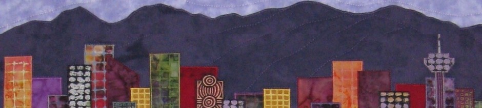
My first step was to look for a source of inspiration. As I usually do, I scrolled through my photo collection, looking for images that would work with a long, narrow format.
I found this photo that I took in 2018. This decorative drain grate with a Raindrops motif stopped me in my tracks as we were leaving the Vancouver Aquarium. I’ve always intended to make an art quilt based on this design of overlapping ripples.
Raindrops drain grate at Vancouver Aquarium
My original plan was to use gray-blue fabrics to emphasize the raindrops theme, but somehow all the colors got pulled and I just couldn’t resist using them all! I fused the bright solids to a dark patterned background.
using ALL the colours
straight line quilting at an angle
I finished it with straight line quilting at an angle, and faced edges.
Rainbow Ripples – Inspired by a decorative drain grate with a Raindrops motif, this piece reflects my love of circular patterns and bright saturated colours.
. . . .
Thanks for stopping by. I will be linking up with these blogs – click on the links below, where you’ll find many other creative and inspirational projects.
Thanks to everyone who made suggestions (on my last blog post, on Instagram and Facebook) about which pieces I should submit to the upcoming Abstract2 Square Foot Show. Here are the 5 pieces I submitted.
I’m so happy to be one of the 70 amazing artists in the 2nd International Square Foot Show! It will go live at 8pm ET (5pm PT) on Wednesday, August 4th!
The show will run August 4-6 and features abstract and impressionist art by artists from all over Canada, the USA and the UK. Each piece will be 12″ x 12″ and will sell for $300 plus $20 shipping.
If you subscribe to the mailing list on the Square Foot Show website you will be automatically entered to win a 12″ x 12″ painting from featured artist Susannah Bleasby (@susannah_bee_art). And 48 hours before the show goes live, they will send out a gallery of all the abstract and impressionist work these artists have created for the online show.
Follow @squarefootshow on Instagram to learn more, for updates and to check out the amazing artists.
. . . .
Thanks for stopping by. I will be linking up with these blogs – click on the links below, where you’ll find many other creative and inspirational projects.
I have completed 3 more pieces for the Abstract2 Square Foot Show. That gives me a total of 8 art works. Now I have to pick 5 of them to submit to the show. Which would you like to see in the show?
I love working on small format pieces, as I find my creativity is stimulated. When I’m working on a large piece, I may consider several different concepts, but I usually only have the time and energy to work on one, maybe two versions. With small format pieces, I can explore several variations on a theme. As I’m working on one piece, I’m thinking about what I can do differently on the next one, and the one after that.
For this show, each piece must be 12″ x 12″ and the theme is Abstract and Impressionist Art. Within those parameters, my general concept was to create simple geometric layouts, showcasing the fabrics. I’m outlining the fabrics with skinny black bias tape to create a crisp graphic-looking composition.
I turned to my fabric stash to select interestingly coloured and patterned fabrics. I found 5 fabrics that created a pleasing composition and created Bright & Bold Stripes (left). Next was a group of neutral fabrics with interesting patterns – Earthy Neutral Stripes (middle). And then bright and intense fabrics – Bright Intense Curves.
Making the quilt top – This is my go-to freezer paper process. In a nutshell, I drew my design on freezer paper, cut the freezer paper apart and ironed each piece to the back of the fabric. I cut the fabric around the freezer paper templates, adding 1/4″ seam allowances. I reassembled the pattern by overlapping the seam allowances and using the freezer paper to hold them together. Working from the back, I stitched in the gap between the paper templates. Then from the front, I trimmed each seam allowance very close to the stitching. This leaves raw edges, which I covered with fusible bias tape.
Freezer paper pattern
Freezer paper template ironed to back of fabrics
Fabrics stitched together and seam allowances trimmed
After fusing on the bias tape, I peeled the freezer paper from the back of the fabrics (I saved the freezer paper templates as I can reuse them several times before they loose their “stickiness”).
Layering and quilting – I trimmed the top to 13′ square. I cut a piece of batting 12.5″ square and adhered it to the top with Misty Fuse. (No backing fabric was required as I would be mounting this on a 12″ square gallery-wrapped canvas.) Then I quilted the bias tape with black thread and quilted each fabric with a matching thread.
quilted – front
quilted – back
Mounting on a frame – I mounted each piece onto a 12” x 12” x .5” gallery wrapped canvas. I used Susan Carlson’s technique to attach a continuous edging to the quilt top, as explained in this blog post https://susancarlson.com/2017/08/26/hang-it-up/ which describes several methods of hanging and displaying quilts.
I used solid black fabric cut 2.5″ x 50″ for the edging fabric. I’ve used Susan Carlson’s technique several times now, and my corners are not always perfect. So I experimented a bit. To ensure my finished edges were straight and square, I drew a 12″ square on the batting with a black marker pen. Then I trimmed the quilt based on the pen lines, not the edges of the fabric. I pinned the edging using the pen line – pinning from the front, then confirming the placement of the pins from the back. I also marked the stitching line with white pencil to ensure a straight, accurate line.
12×12 square drawn on back with pen
pinning edging and marking sewing line
pinning edging – back
Those changes really improved the fit of the edging over the wrapped canvas frame, but I still wasn’t entirely satisfied with the corners. A Google search yielded this article from Threads Magazine. I followed their instruction in step 4 – “When you get to a corner, lower needle into exact corner, clip boxing to needle, pivot fabric, spread boxing around corner, and continue sewing. Repeat at each corner.” The clipping of the edging fabric as I reached each corner resulted in perfect corners every time!
. . . .
Thanks for stopping by. I will be linking up with these blogs – click on the links below, where you’ll find many other creative and inspirational projects.
Earlier this year I read about the Square Foot Show on Instagram. I submitted my application and I’m thrilled to say I will be one of the 70 artists whose work will be featured in the August online show.
The show will run August 4-6 and features abstract and impressionist art by artists from all over Canada, the USA and the UK. Each piece will be 12″ x 12″ and will sell for $300 plus $20 shipping.
Head over to the Square Foot Show website to get all the details. Scroll down to see a full list of the participating artists. And subscribe for a chance to win a 12″ x 12″ painting from featured artist Susannah Bleasby (@susannah_bee_art). Follow @squarefootshow on Instagram to learn more, for updates and to check out the amazing artists.
Almost all of the participating artists are painters, so it will be interesting to see how the purchasers react to my quilted fabric artworks. I will be mounting my pieces on wrapped canvases so they can be hung like a painting.
Each artist has been invited to submit between 3 and 5 pieces. I have been working on a few pieces that are possibilities for the show. Here are some snippets of my first 5 pieces.
However, these may not all be included in my final submissions. I have ideas for more pieces, so depending on how many I complete before the entry deadline and which ones I like the best, the pieces I submit may or may not include these.
. . . .
Thanks for stopping by. I will be linking up with these blogs – click on the links below, where you’ll find many other creative and inspirational projects.
I started creating this baby quilt in April. I finished piecing it in early May and pinned it to my design wall. But then I set it aside to work on other projects.
This weekend, I finished it. I layered it with batting and soft gray fleece backing. I cut the batting to 1.5 inches wider than the top on each side, and I cut the fleece backing even larger, so there was about 4 inches extra on each side.
I quilted around the edge of the top, then quilted 30 degree straight lines parallel to the triangle sides, and about 5 to 6 inches apart.
Then I trimmed the fleece so it was 2″ wider than the batting on all sides, and folded it over to the front as binding. I used the mitering technique described in faux blanket binding by red flannel pantry. I straight-stitched about 1/4″ in from the raw edge of the binding, then zigzag stitched over the raw edges.
Here it is fresh out of the washer and dryer, all soft and cuddly.. The finished size is 40 x 44 inches.
. . . .
Thanks for stopping by. I will be linking up with these blogs – click on the links below, where you’ll find many other creative and inspirational projects.
Here’s my donation for SAQA’s annual Benefit Auction. SAQA invites each of its members to create a 12 x 12 inch piece of art and donate it to the online auction. Last year there were over 500 submissions from SAQA members around the world.
Here’s my donation piece for this year – Basking in the Summer Sun.
Since 1911, the famous marble lions, dubbed Patience and Fortitude, have captured the imagination and affection of New Yorkers and visitors alike. They flank the main entrance to the downtown branch of the NYC library. Posing regally, they gaze down at the coming and going of the library patrons and visitors.
It was a bright summer day when I visited the library, so my photos of the lions show dramatic sunshine and shadows. This is Patience (on the south side of the library entrance) basking in the summer sun against a backdrop of leafy green trees.
I enjoyed the challenge of creating the NYC library lions in monochromatic colors for the Chromatopia exhibition. But when I took these photos while in New York, my intention was to depict the lions in realistic colors – shades of gray against a backdrop of leafy green trees. (I have since learned they are actually carved from pink marble, but when I saw them in 2019, they looked like they were carved from gray stone.)
There were a couple of advantages to using the same design again. The first is how I created the line drawing. I applied a pencil sketch filter to the photo of the orange lion and printed that as my line drawing – much quicker and easier than using the original photo as my starting point. I labelled each shape with a value code, then printed a full-size version, as well as a mirror copy to use for tracing the shapes on fusible web (Steam-a-Seam Lite).
The other advantage is the selection of fabrics with the correct values, which is the trickiest part of this technique. (See my post about the challenges I had with selecting values for the blue lion.)
Since I was very happy with the values I used for the orange lion, I only needed to find gray fabrics with the same values. I selected the fabrics, then used a black & white filter to ensure the grey fabric values were comparable to the orange fabric values. (I keep the value chart taped to the cupboard above my ironing station for reference while cutting out the shapes.)
As with the orange lion, I cut the base layer from the lightest fabric. I fused the base layer to parchment paper, then I gradually added the light, medium-light, medium, medium-dark and dark fabrics. I love the way the lion appears increasingly solid and 3-dimensional as fabrics are added, so I take a lot of photos during the process. Here are a few that show the progression. (Click to enlarge)
I think he’s a pretty regal-looking, handsome fellow!
Here’s the original photo I took in NYC in 2019.
. . . .
Thanks for stopping by. I will be linking up with these blogs – click on the links below, where you’ll find many other creative and inspirational projects.
Last August, I started thinking about what I would submit to the Grand National 2021 exhibition ‘Crossroads’. I made two pieces specifically for this exhibition: Night Driving and A Study of Pattern and Perspective. I submitted my entries in December, but didn’t want to post about them until the exhibition opened on May 2. This post is about Night Driving – my inspiration and construction techniques.
As I often do when searching for inspiration, I did a Google image search for the theme title and similar words. As usual, one image search led to many others and eventually I was looking at a screen full of time-lapse photos of highway traffic at night. I was struck by the beauty of the streams of light, and I decided to see if I could replicate that effect in a fibre art format.
I started with a sketch of two highways, one passing over the other, with red taillights on the right and white headlights on the left. I cut the highway shapes from freezer paper to use as templates as my plan was to quilt the highways separately from the background.
How to depict streams of lights? I considered paint, but that’s not my style. I considered fusing very skinny strips of shiny fabric. It had to be bright enough to show up against the dark background. I decided to use embroidery floss couching it in place by zigzag stitching over it with shiny thread. I made a couple of samples and was very happy with the results.
I constructed each highway piece separately. I layered black fabric over black felt and stitched through both layers. For each one, I started by stitching 7 evenly spaced lines, over which I couched embroidery floss. This ensured my lines curved accurately with the curve of the highway. Then I filled in with a variety of colors and overlapped some of the curves. I frequently pinned the highways on the design wall to evaluate the effect.
light streams – starting
light streams – details added
I made the highway pieces a couple of inches longer than the templates to give me some ‘wriggle room’ when I did the final positioning and stitched them to the background. So on the design wall, during construction, the highways extended past the edge of the background. At some point I realized I really liked that effect and incorporated it into my final design.
Here is the finished piece – Night Driving. It is 28″ x 22″. This my artist statement:
Driving through the night, across the featureless landscape, headlights and taillights blur into glowing streams of light, crossing in the darkness.As I drive, I realize I am surrounded by strangers; all of us travelling in our own socially isolated bubbles. I wonder about the people in all the vehicles around me. I wonder about their destinations – are they heading home, across town to visit friends, or perhaps starting a long trip toward a new adventure? I wonder about their hopes and dreams.
On the weekend, at the virtual awards ceremony, I was thrilled when ‘Night Driving‘ was awarded First Place for Excellence in Thread Work. You can see all the pieces in the exhibition on the Grand National website. This page has a slideshow of the 48 pieces. This page shows thumbnails of all the entries, and you can click on any item to see a full size image with the details. And you can vote for your favourite for the Viewer’s Choice Award.
Thanks for stopping by. I will be linking up with these blogs – click on the links below, where you’ll find many other creative and inspirational projects.
Grand National is a Canadian fibre art exhibition that will travel to various venues across the country. The theme for the 2021 exhibition is Crossroads. The exhibit was scheduled to open today at the University of NB Art Centre with an online Awards ceremony. But New Brunswick recently announced a Covid shutdown. The quilts are hung and ready for judging, but the judges have not been able to enter the venue. So the Awards ceremony has been delayed.
The exhibition can be viewed online on the Grand National website. This page has a slideshow of the 48 pieces. And this page shows thumbnails of all the entries, and you can click on any item to see a full size image with the details.
I submitted 3 entries to this exhibit and I’m thrilled to say that all of them were accepted!
One of my pieces Intersections, I made last year and posted about it a lot between May and October. It wasn’t intended for any specific exhibit, but it seemed appropriated for the Crossroads theme.
My other two pieces Night Driving and A Study of Pattern and Perspective were made specifically for the Crossroads exhibition. I worked on them between October and December, but never did post about them. I’m excited to be able to now show these two pieces. I will post more about my inspiration and construction techniques for these two pieces in the near future.
An online gallery and artist talks (including my talk about my 3 pieces) should be posted soon on the University of NB Art Centre website. I’m honoured they selected my piece Night Driving for their poster.
UPDATE May 4 – on the University of NB website, you can now watch the Exhibition Videos (several of the artists have recorded talks about their artworks – including me) and explore the Online Galleries.
Everyone is invited to attend the Grand National Virtual Opening and Awards Ceremony on Saturday May 8th at 4:00 pm Atlantic time. You can register at this link if you would like to attend. Hope to see you there!
. . . .
Thanks for stopping by. I will be linking up with these blogs – click on the links below, where you’ll find many other creative and inspirational projects.
There’s a new baby quilt evolving on my design wall, for my new great-niece Alice.
Alice has an older brother and sister who both have baby quilts from me. I thought it would be fun to use some of the fabrics from their quilts in this one.
This quilt will be mostly equilateral triangles, with a few diagonal bars. I came up with the idea for the bars because I have one fabric (the dark gray with white dots) that I really want to include in this quilt, but it isn’t wide enough for a triangle piece. I’m going to purposely offset the points of the triangles when I join the rows – for a more random look. My palette is low-volume neutrals, pinks and a few bright greens.
Here’s what I have so far on my design wall.
I cut a few triangles of each color and arranged them somewhat randomly on the design wall. I kept adding fabrics until I liked the composition. In addition to fabrics used in the above two quilts, I also included a pink fabric that my sister Anne (Alice’s grandma) and I dyed together when we were working on a collaborative project.
I haven’t decided on the overall size of the quilt. The top two rows are pieced, but I can always add more triangles to the ends if I decide to make it bigger. I’m just going to continue piecing rows until it looks big enough, or I run out of these fabrics.
. . . .
Thanks for stopping by. I will be linking up with these blogs – click on the links below, where you’ll find many other creative and inspirational projects.
For the last week or so, I’ve been busy getting quilts ready for upcoming exhibits – making hanging sleeves and labels. I shipped off a couple of quilts last week and I have more to go this week.
One piece that I shipped last week was ‘Shades of Pink‘. I made this art quilt last spring for the annual textile art exhibit Cherry Blossoms: A Textile Translation. As with so many other exhibits in 2020, it was cancelled due to the pandemic. But I’m thrilled to say it will on display this year, from April 8 to May 2, at the Silk Purse Arts Centre in West Vancouver.
Shades of Pink, by Terry Aske
Here’s some more information about the exhibit, including a very exciting concept. They will be broadcasting a live virtual opening! It will be on April 8th at 7pm Pacific time. It will include a video tour of the exhibition, and some of the 24 artists (including me) will discuss their inspirations, and the audience can ask them questions.
Here’s the link to the opening reception (and recordings of previous virtual openings) at the West Van Arts Council YouTube channel: https://www.youtube.com/watch?v=jTDTpRLU70g The event will be recorded, so if you can’t make it to the live session, you can watch it later.
. . . .
Thanks for stopping by. I will be linking up with these blogs – click on the links below, where you’ll find many other creative and inspirational projects.