Last week, I attended Quilt Canada in Toronto ON with my friend Janet.
We arrived Tuesday evening at the ALT Hotel near the airport, and were greeted by wonderful signage and logos that reminded us of colorful modern quilts. We thoroughly enjoyed the hotel.


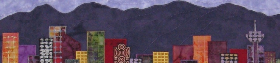
On Tuesday evening, we attended the National Juried Show (NJS) Awards Ceremony. I had been notified that one of my entries had been chosen for an award, so I was very excited. I was thrilled when it was announced that Circular Thinking had been awarded 1st place in the Art – Abstract category. Then, I was thrilled and amazed when I was called up again to receive the 3rd place award in the Art – Naturescapes, Pictorial category for Swoop. We couldn’t see the actual quilts until the next day when the show opened, so the photos below were taken later.


We spent the next 4 days attending lectures and events, shopping in the merchant mall, meeting friends and, of course, viewing hundreds of gorgeous quilts! This is the first year photos of the quilts were permitted, so I took lots! Here are some more of my favorites.

Terry Aske_Anne deVerteuil_FIRE_2016 CQA NJS

Janet Archibald_A Vancouver Winter

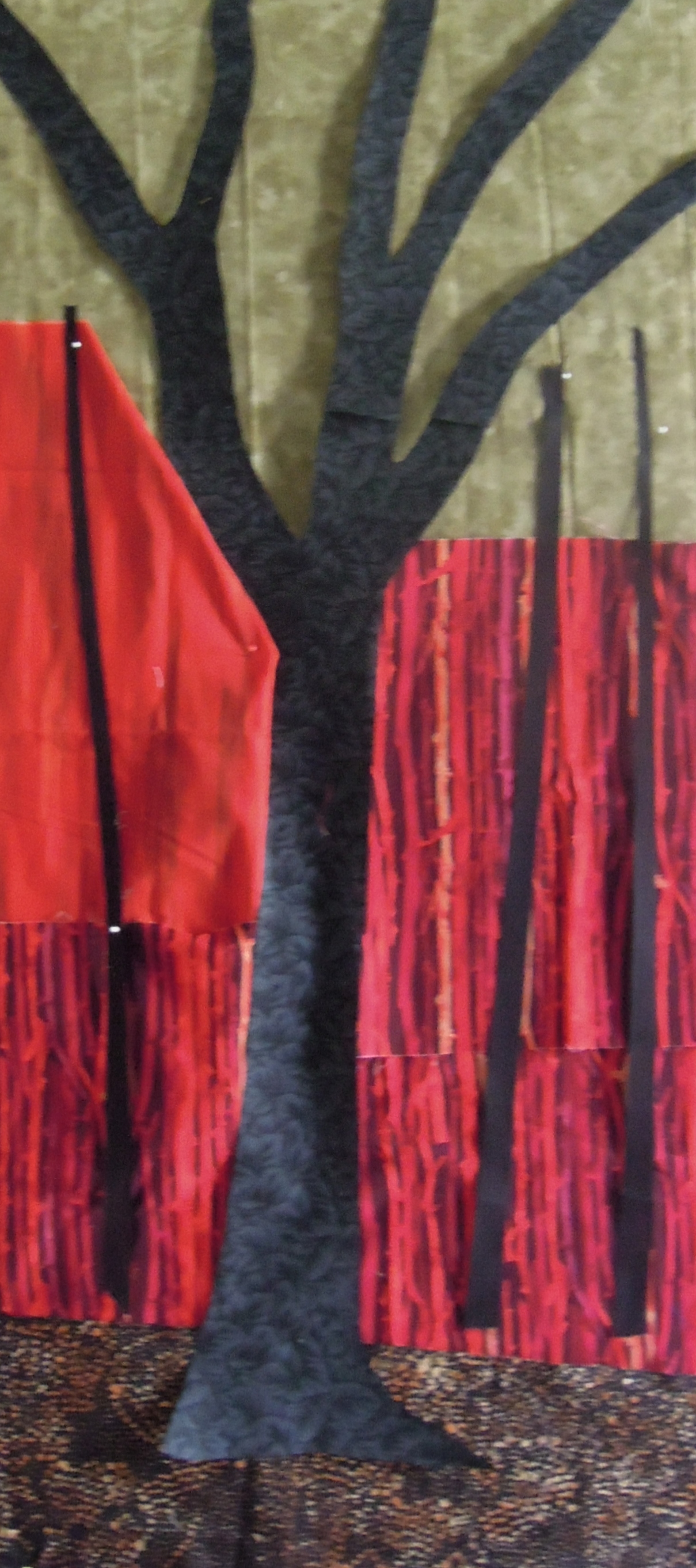
Beth Van Wyngaarden_ Birch Trees, Fall

Marianne Haak_Shards of Glass

Margaret Cale_Waves

Ann Marie Patrick_ Toadstools

Anita Payne_From the World to Canada

Judy Weiss_Height of the Storm

Joanne Love_Curiosity

Alison Dean Cowitz_Leo
There were also several special exhibits, including Canadiana by members of the Fibre Art Network members, and Cascade of Colours, by the Beaconsfield Quilters Guild.

FAN Canadiana exhibit 1

FAN Canadiana exhibit 2
Cascade of Colours_Beaconsfield Quilters Guild
You can see all of the award winning quilts on the CQA site here. And within a few days, there should be a link added to see all of the quilts in the show.
You can see lots more of the quilts on Instagram – hashtag #quiltcanada and #quiltcanada2016.
Thanks for stopping by. Today, I’m linking up with these blogs – click on the links below, where you’ll find many other creative projects to inspire you.


